Most investors think the main question in a bull market is whether to be bullish or bearish.
Early in a recovery, that can be enough. When fear is high, positioning is defensive, and the market has just survived a major drawdown, the broad decision matters most. Either you recognize that risk appetite is returning, or you stay trapped in the last bear-market narrative while prices move without you.
But once the bull market is already visible, the game changes.
The harder question is no longer whether assets can go higher. In a broad risk-on environment, many of them can. Indices can grind higher. Leaders can keep leading. Lagging stocks can catch up. Commodities can remain structurally strong. Bitcoin can consolidate for months and still belong to a larger bull-cycle structure.
The real question becomes more selective:
Where is the upside still unresolved?
That distinction matters because bull markets do not reward all bullishness equally. Being broadly right on direction is useful, but it is not the same as being well allocated. Some charts have already made the easy part of the move. Others are still in the middle of the move. A smaller group may still be sitting before the phase where momentum accelerates.
That is where historical analogs become useful.
Not because they map every candle in advance.
Not because the forward path needs to follow the dashed lines perfectly.
Their value is in showing the usual direction, slope, drawdown profile, and forward distribution after similar setups. If several historical windows looked like today, and most of them continued higher over the next few months, that does not mean tomorrow must be green. It means the current structure belongs to a family of past conditions that usually resolved in a certain way.
For an investor, that is often enough.
The goal is not to know the exact day the next move begins. The goal is to know whether an asset still has fuel left in the tank.
When the Trend Is Real, but the Asymmetry Has Changed
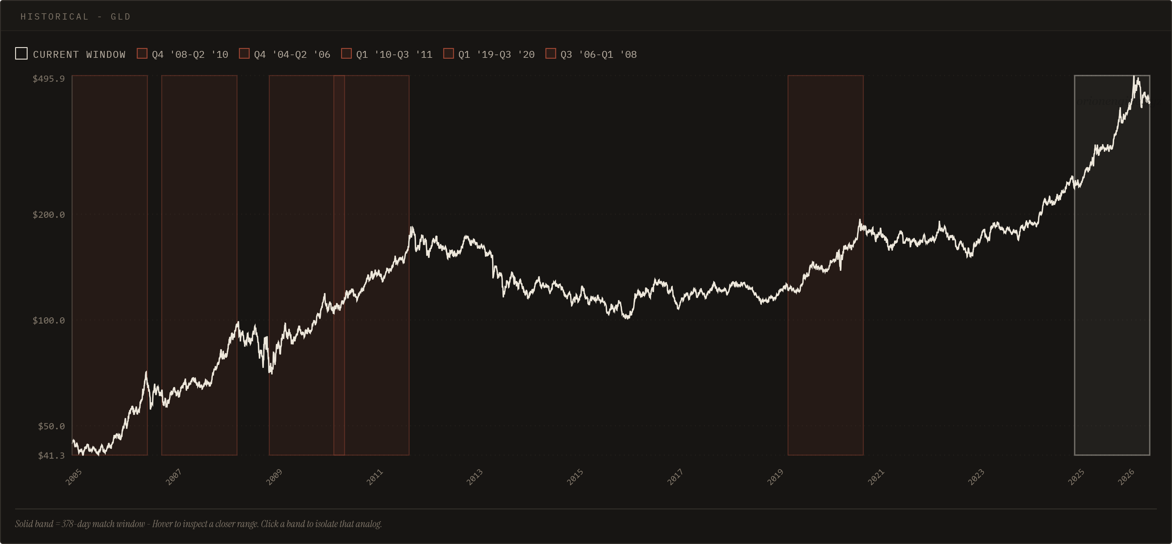
Metals are a good example of why this matters.
A strong trend can remain structurally valid while becoming less attractive on a forward risk/reward basis. After a large vertical move, the question changes. It is no longer enough to say, "gold is in an uptrend." That may be true. The better question is whether the next unit of upside still compensates for the risk of digestion.
This is where many investors get caught.
They identify the correct theme too late, then extrapolate the prior move forward as if the market still owes them the early-cycle return. But markets are rarely that generous. Once a trade becomes obvious, widely discussed, and visually extended, the upside can remain positive while the asymmetry quietly deteriorates.
That does not mean the asset must collapse. It may simply pause. It may chop. It may frustrate both bulls and bears. It may keep its long-term trend intact while becoming a poor place to deploy fresh capital compared with alternatives that have not yet completed their move.
This is one of the most important distinctions in a bull market:
The best asset is not always the strongest chart. Sometimes it is the chart where the strength has not fully expressed itself yet.
Broad Indices: Still Constructive, but Less Asymmetric
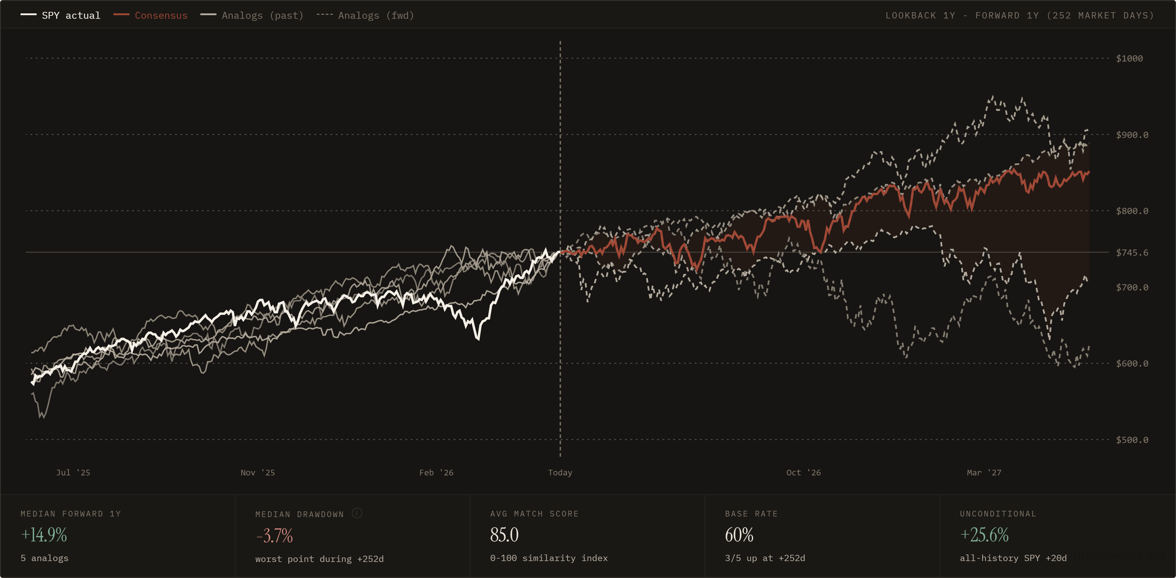
The same logic applies to the broader market.
The current SPY analogs still show a constructive forward path, with a median 1-year forward return around +14.9% and a relatively contained median drawdown around -3.7% across the matched windows.
That is not bearish.
In fact, it argues against the instinct to overthink the market and fight the trend too early. Bull markets often continue beyond the point where they begin to feel too obvious. Investors who constantly look for the top can miss months of upside simply because they are trying to be more sophisticated than the trend.
But a constructive index setup is not the same as maximum opportunity.
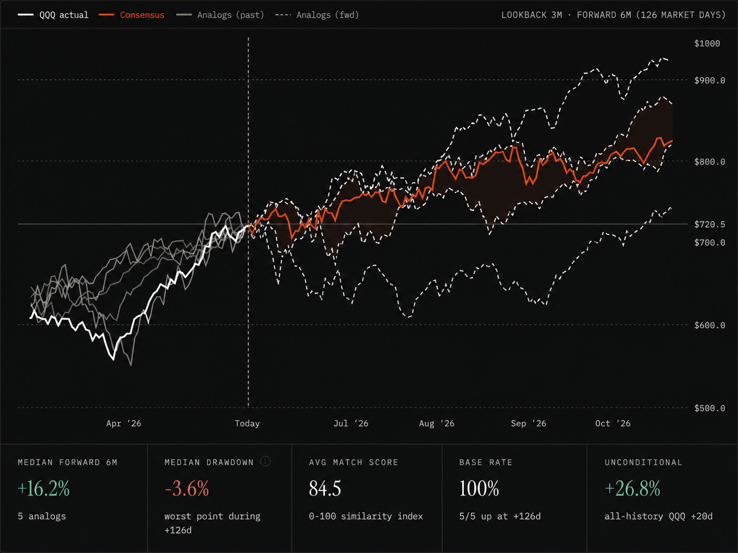
QQQ shows a similar idea. The analogs point toward continued upside, with a median 6-month forward return around +16.2% and all five selected analogs resolving higher over that window. Again, the message is not weakness. The message is that the broad market still has support, but the return profile is moderate compared with more selective opportunities.
This is where allocation becomes more important than direction.
If the market's broad analog structure suggests 10 to 20 percent upside, that may be a good environment to remain invested. But if individual charts within the same environment show cleaner or larger unresolved upside, the investor's edge shifts from simply being long the market to choosing the better expression of the trend.
Being bullish on the index may be right.
Being bullish on the right part of the market may be better.
Leaders Can Still Work, but They Need More Scrutiny
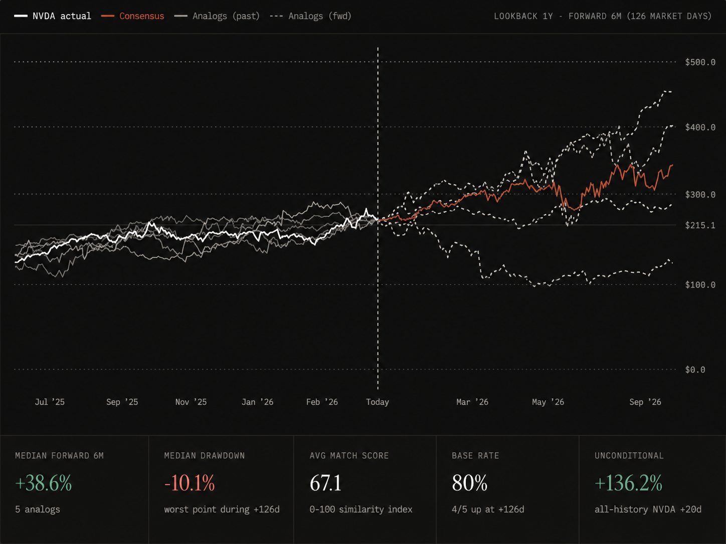
NVDA is the interesting middle case.
The forward analogs still show large upside, with a median 6-month forward path around +38.6%. On the surface, that looks stronger than the index setup. But the quality of the setup is less clean. The average match score is lower, around 67.1, and the median drawdown is wider, around -10.1%.
That does not make the setup bad. It makes it more complicated.
This is exactly the type of distinction analogs are useful for. A headline return number can look attractive, but if the match quality is weaker and the drawdown profile is wider, the opportunity may require more tolerance for noise. A leader can continue leading, especially in a bull market, but once the market already recognizes it as the leader, the trade often becomes less forgiving.
The lesson is not to avoid strength.
The lesson is to separate clean continuation from crowded continuation.
A stock can still have upside and still be a less efficient place to allocate new capital than a laggard whose setup is only beginning to resolve. The best bull-market trades often come from assets that have enough strength to confirm the trend, but not so much that everyone has already crowded into the same story.
Laggards With Momentum: Where the Bull Market Still Has Room to Breathe
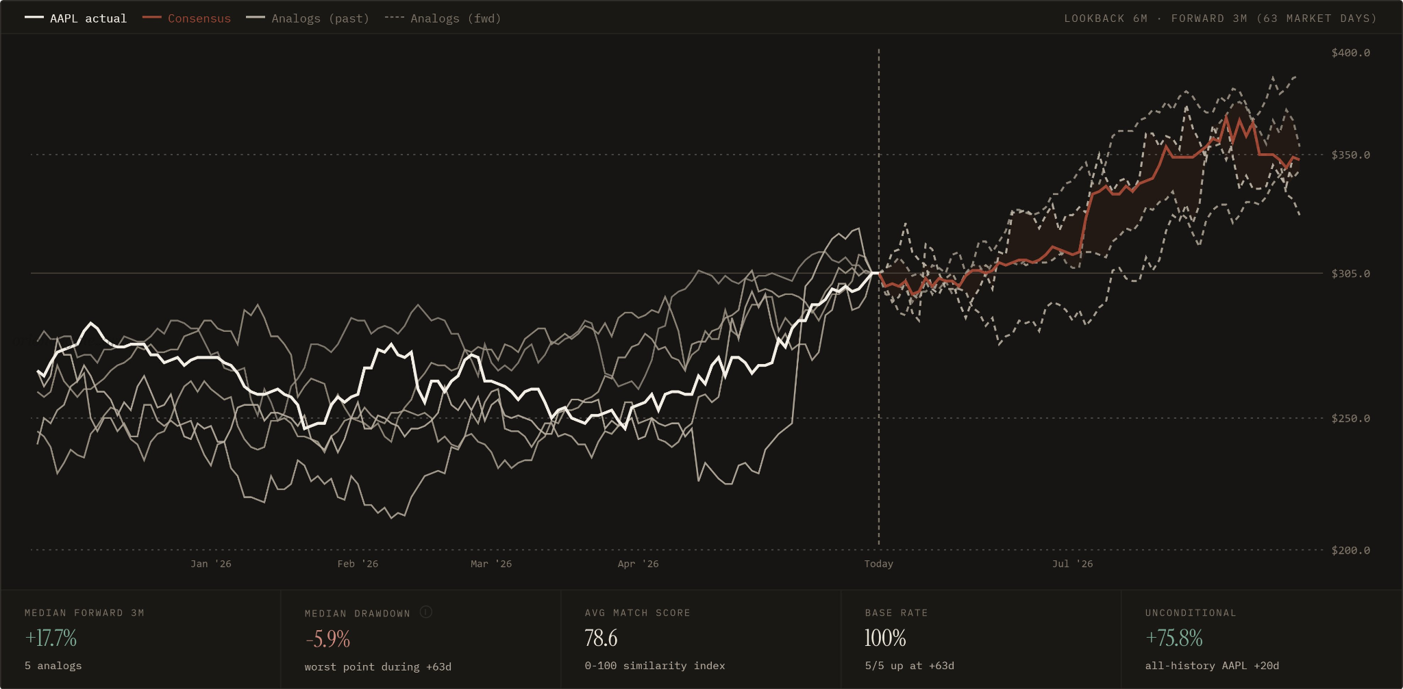
This is where AAPL and AMZN become useful examples.
AAPL's analogs show a median 3-month forward return around +17.7%, with all five selected analogs resolving higher over the period. The match score is also solid, around 78.6. That creates a different kind of setup from the broad index. The upside is not enormous, but the structure looks cleaner and more focused.
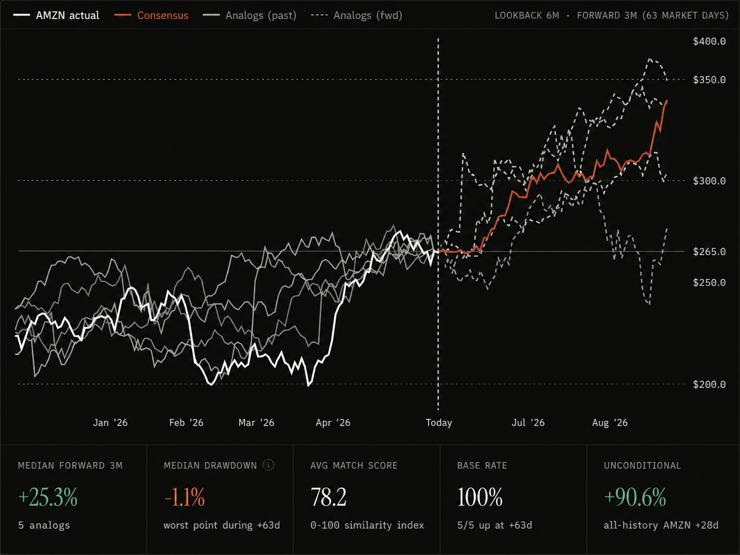
AMZN is even more interesting.
The analogs show a median 3-month forward return around +25.3%, with a 100% base rate across the selected matches and a median drawdown of only around -1.1%. No single analog result should be treated as a guarantee, especially with only five selected windows, but as a comparative setup, this is exactly the kind of thing worth paying attention to.
This is what "juice" means in a bull market.
It is not just a chart that has gone up. It is a chart where the historical structure suggests the move may still be underdeveloped. The asset has started to participate, but the forward analogs imply that similar setups often had more room to run.
This is also where many investors hesitate. They prefer buying what has already proven itself beyond doubt. They wait until the story is obvious, the chart is vertical, and the market has already repriced the opportunity. But by then, the return profile may have shifted from asymmetric to crowded.
The better opportunity is often earlier in the rotation.
Not so early that the chart is still dead. Not so late that the easy part has already happened. Somewhere in the middle, where strength is emerging but the market has not fully priced the next leg.
Bitcoin: Consolidation Does Not Always Mean Exhaustion
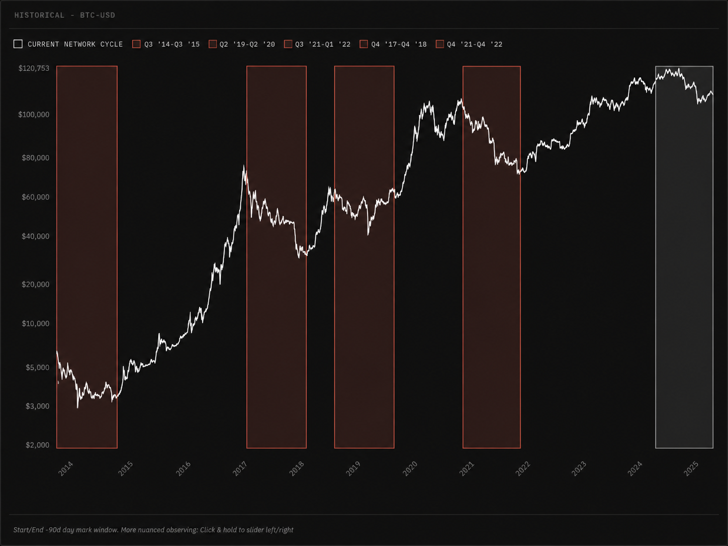
Bitcoin adds another layer because it behaves less like a traditional equity and more like a cycle asset.
The historical analog windows are useful here not because Bitcoin repeats perfectly, but because its large advances often share a familiar rhythm. The move begins, accelerates, overheats, corrects, consolidates, frustrates, then sometimes continues before the cycle is fully exhausted.
That middle zone is difficult to live through.
When Bitcoin pauses after a major advance, many investors assume the opportunity has disappeared. The chart no longer feels exciting. The move becomes choppy. Sentiment cools. The asset stops rewarding impatience.
But historically, major Bitcoin bull phases have often included long periods that looked unproductive before the next expansion. The analog question is therefore different from a 3-month equity setup. It is less about whether every short-term path looks clean and more about whether the current window still belongs to a broader bull-market structure.
If it does, then consolidation is not necessarily weakness. It may simply be the market resetting before the next phase.
That is the broader point of analog work. The same forward return number does not mean the same thing across assets. A stock like AMZN may offer a clean catch-up setup over three months. An index like SPY may offer moderate but persistent upside. Bitcoin may offer a more volatile cycle structure where patience matters more than short-term smoothness.
The job is not to force every asset into the same template.
The job is to understand what kind of opportunity each chart is actually offering.
The Real Edge: Ranking Opportunity
This is where historical analogs are often misunderstood.
People want them to behave like a crystal ball. They look at the forward paths and ask whether the market will follow the exact line. That is the wrong standard. Markets are too noisy, too adaptive, and too path-dependent for that kind of precision.
The better use is comparative.
If SPY analogs show moderate upside, QQQ analogs show similar broad-market confirmation, NVDA shows larger but noisier continuation, AAPL and AMZN show cleaner laggard catch-up, and gold looks extended after a major run, then the value is not in mapping the exact daily path of each asset in advance.
The value is in ranking opportunity.
That is what investors actually need. Capital is finite. Every allocation has an opportunity cost. In a bull market, the question is not simply "what can rise?" Many things can rise. The more useful question is:
Where is the market still paying me best for taking risk?
Historical analogs help answer that by showing what usually happened after similar setups. They provide a way to compare trend maturity, forward return potential, drawdown risk, and base-rate behavior across different assets.
That does not remove uncertainty.
It organizes it.
And in markets, organizing uncertainty is often more valuable than pretending to eliminate it.
Bull Markets Reward Selectivity
In a bear market, the main challenge is surviving fear.
In the early phase of a recovery, the main challenge is recognizing that the trend has changed.
But in the middle of a bull market, the challenge becomes more subtle. The investor has to avoid two opposite mistakes at the same time: becoming too bearish because the market already ran, and becoming blindly bullish on assets whose best upside may already be behind them.
This is why the "juice" question matters.
A chart can still be bullish and no longer be the best opportunity. A leader can still rise and no longer offer the cleanest asymmetry. An index can continue grinding higher while selected laggards offer better forward potential. A cycle asset can look tired in the short term while still belonging to a larger continuation structure.
The point is not to map every day in advance.
The point is to identify where similar historical setups usually went next, how much downside they tolerated along the way, and whether the forward path still justifies the risk.
That is the real use of analogs in a bull market.
Not just asking whether the market is going higher.
Asking where the upside is still alive.