Most traders start their analysis from the headline. PCE came in better than expected. GDP came in better than expected. Earnings beat estimates. Oil fell. The dollar weakened. The VIX spiked. Bitcoin decoupled from equities. Breadth improved. A stock sold off after what looked like good news.
The headline is visible to everyone, but it often arrives after the market has already started revealing its intent. By the time the data is released or the earnings call begins, price has moved, volatility has shifted, positioning has built, and the lead-up has created the conditions for whatever reaction comes next.
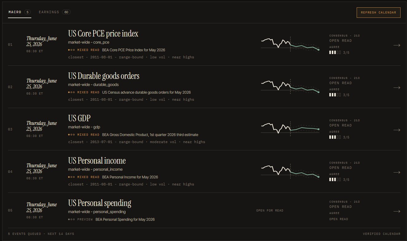
The recent PCE and GDP setup was a good example. On paper, the data was not bearish. Inflation was not worse than expected, growth was holding up, and the basic macro interpretation should have supported risk assets. Yet QQQ had already started to lose strength before the release, erased its gains, and then gapped down the following session.
That reaction looks confusing only if the headline is treated as the starting point. The market did not enter the release as a blank slate. It had already rallied, expectations were embedded, and the event became a point where the prior setup resolved. The data mattered, but the structure around the data mattered more.
The same signal can mean opposite things
One of the easiest mistakes in markets is to treat a single variable as if it always means the same thing. A VIX spike sounds bearish because volatility is associated with stress. If the index is below major trend levels, breadth is breaking down, credit is widening, and volatility is rising from an unstable base, that can confirm deterioration.
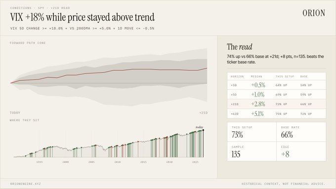
The same spike can mean something different inside an intact bull-market structure. If SPY remains above its 200-day average and the selloff is contained, a volatility reset can mark fear inside a constructive trend rather than a deeper breakdown. The signal is never separate from the environment that produced it.
Correlations are useful until they become laws
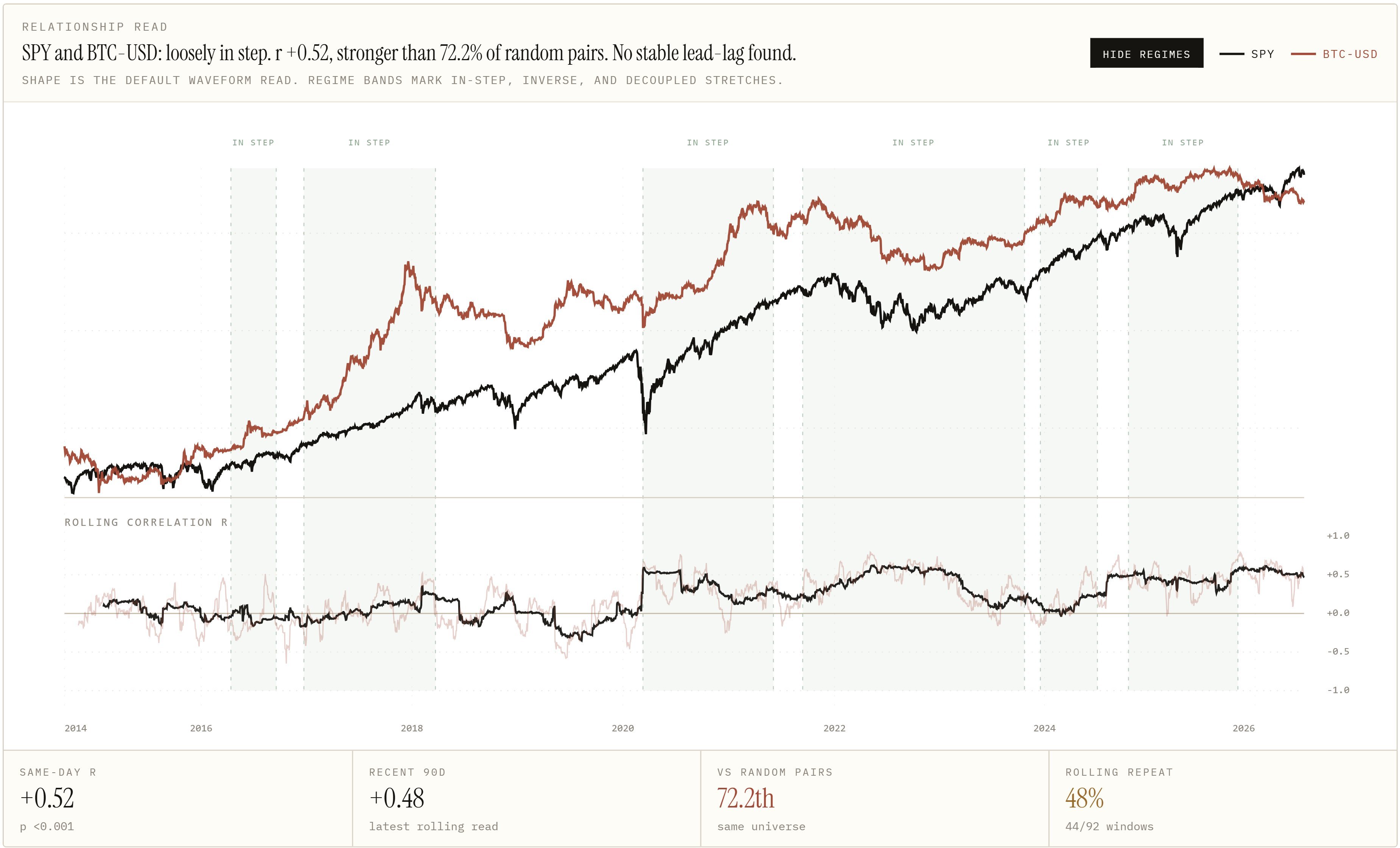
Bitcoin and the dollar are a good example. A weaker dollar often supports risk appetite, but the relationship is not stable enough to be treated as a permanent rule. Bitcoin sometimes trades like high-beta technology, sometimes like a liquidity sponge, and sometimes disconnects from both equities and the dollar.
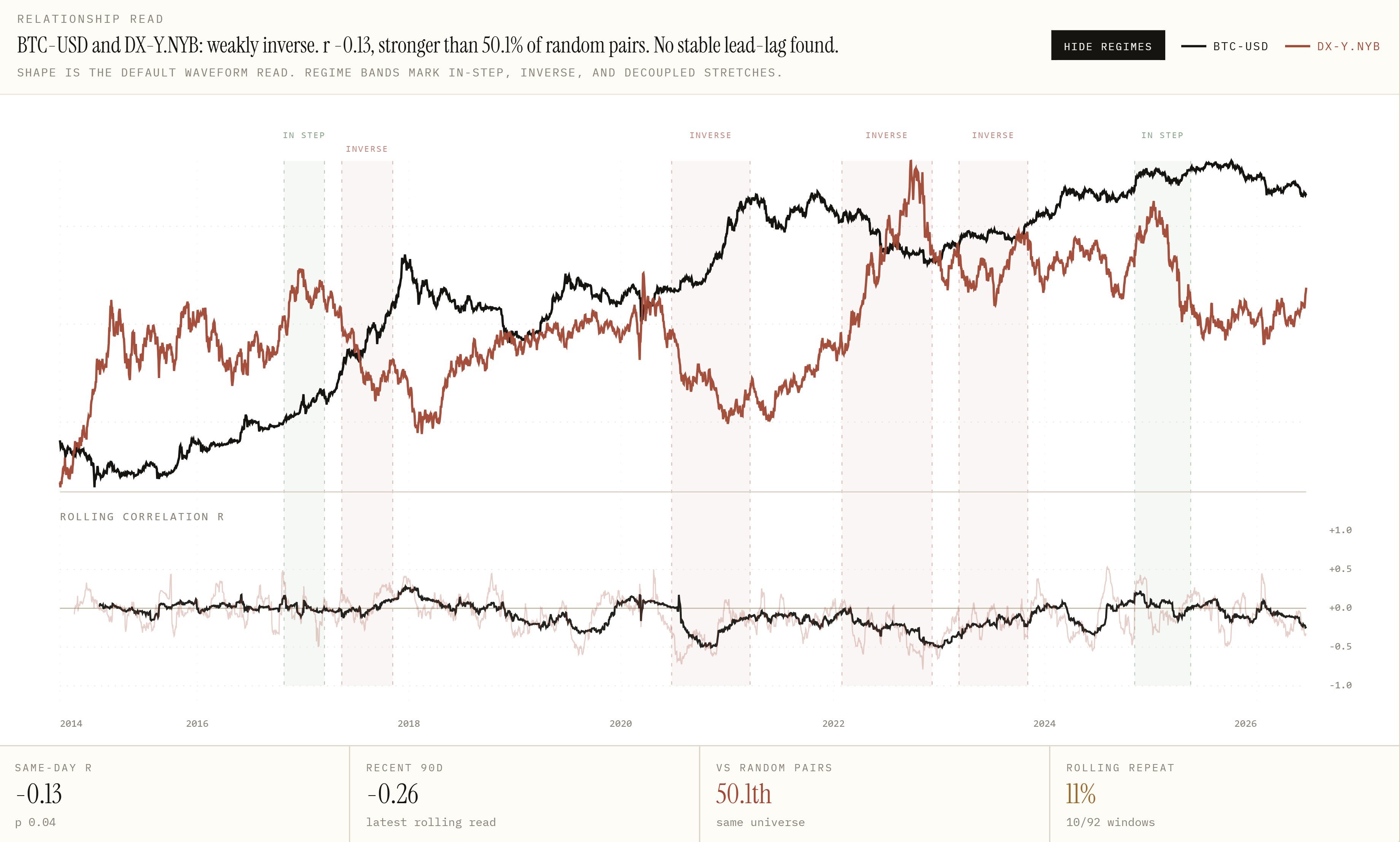
A weak dollar during liquidity expansion is not the same as a weak dollar during a growth scare. Bitcoin lagging during a broad risk rally is not the same as Bitcoin lagging during a macro bear market. The useful question is when the relationship looked like this before and how those windows resolved.
Oil shows why first-order logic can fail
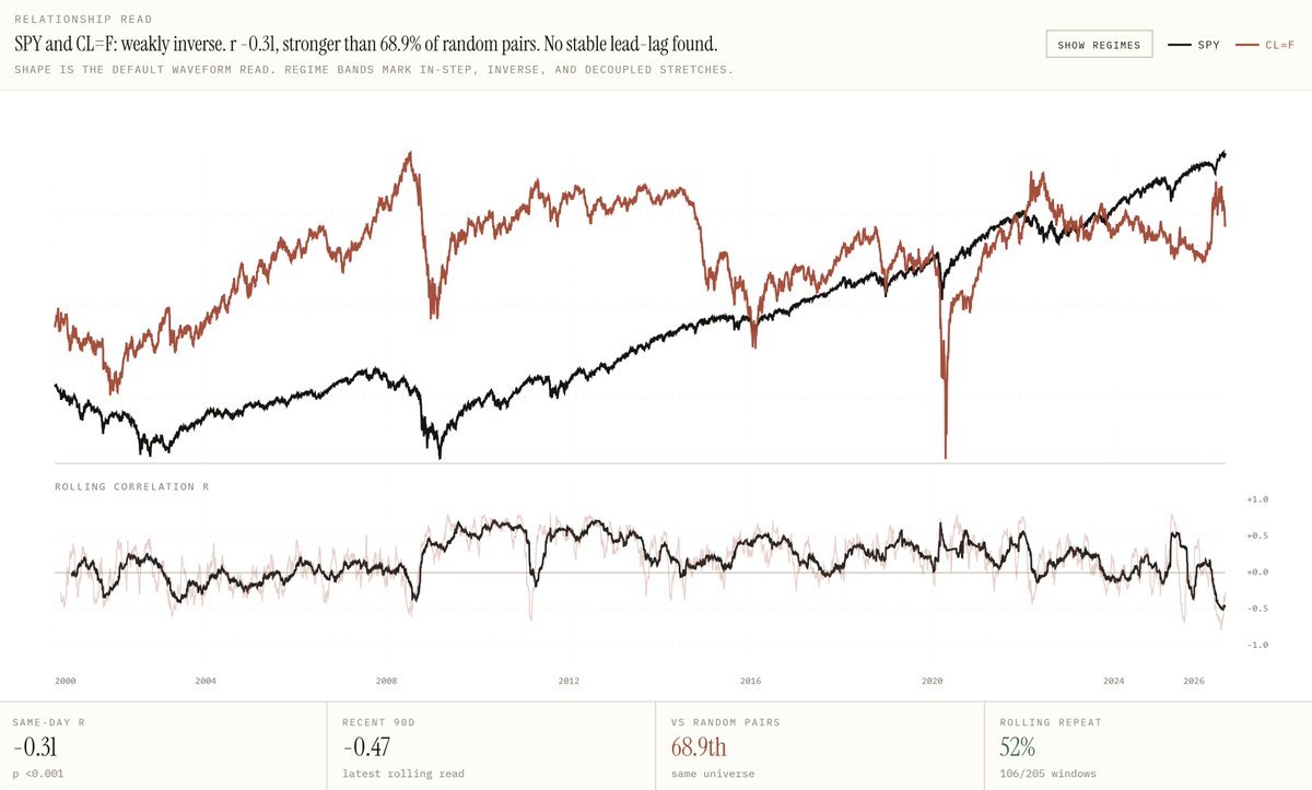
A falling crude price is often described as bullish for equities because it reduces inflation pressure and input costs. In stable growth, that can be reasonable. Sharp oil declines have also appeared during recessions, demand shocks, and crisis periods. In those environments, falling oil can be the market pricing weaker growth.
Event reactions are shaped before the event
Earnings work the same way. A stock entering earnings after a long rally is not the same as one entering after a deep reset. A hated stock with low expectations can rally on a decent report. A loved stock can sell off after strong results if perfection was already reflected in price.
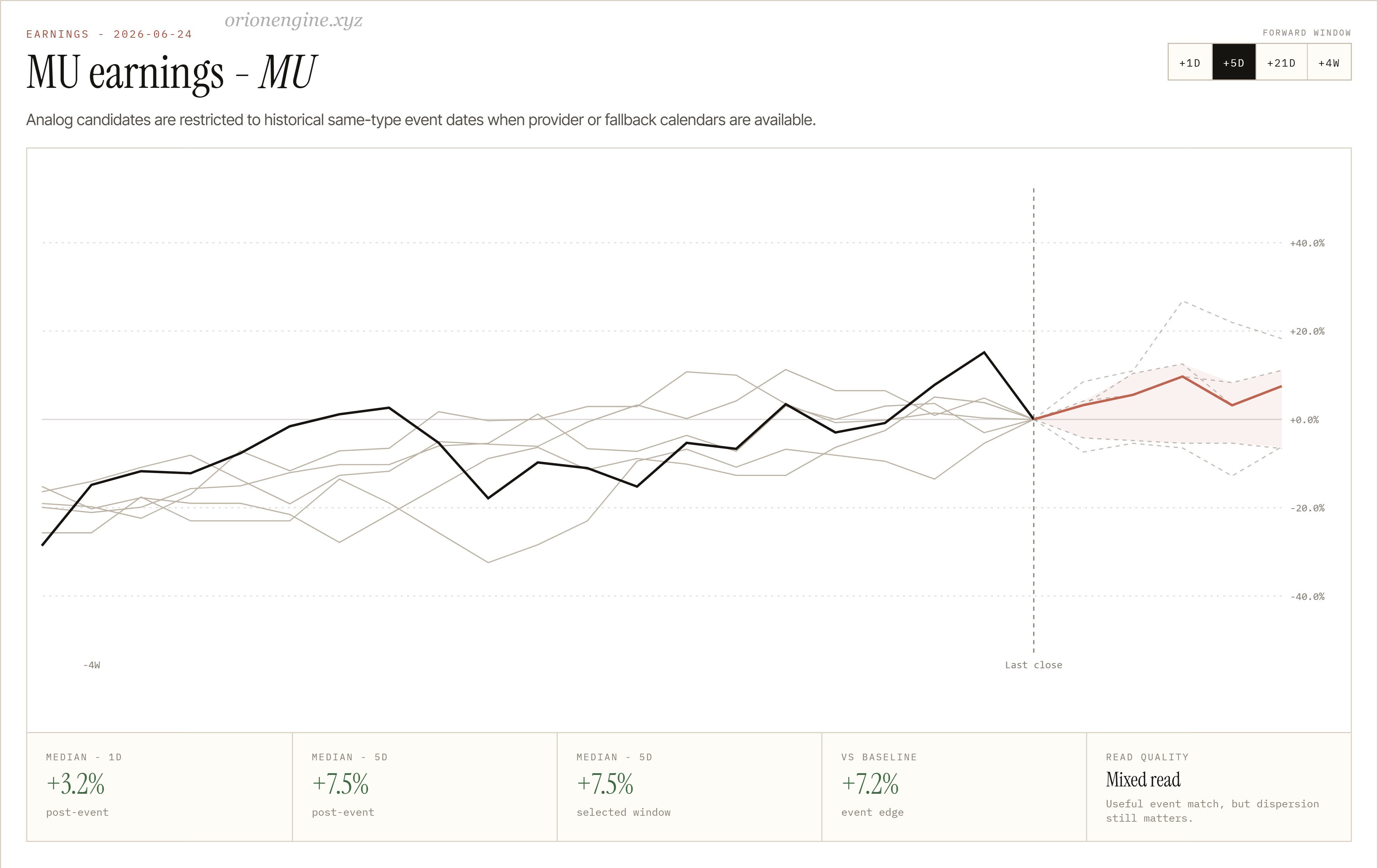
The useful part is not knowing the earnings number in advance. It is seeing whether the market is entering the event stretched, washed out, unstable, or constructive, and how similar lead-ups behaved afterward.
The second layer is where the information lives
The first layer is obvious: the headline, daily candle, earnings result, macro release, and simple correlation. The second layer asks what happened before the headline, whether breadth confirmed the index, whether volatility came from danger or complacency, and whether similar historical windows produced consistent outcomes.
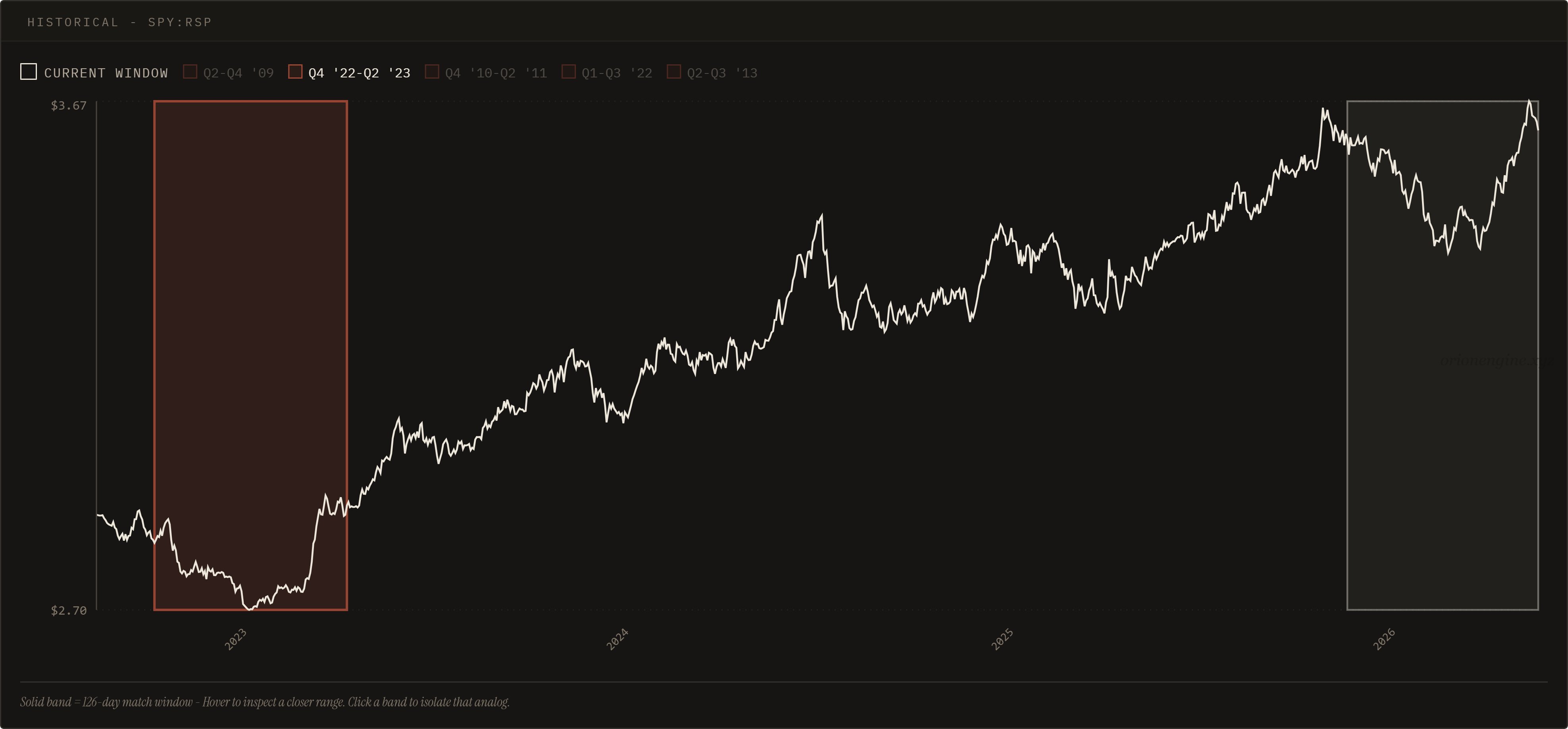
These clues are easy to miss because they are not dramatic breaking-news events. They are structural. When markets are mixed, the trader who reacts only to headlines ends up chasing whichever story feels most convincing that day.
A better approach is to ask whether the current structure has appeared before, how those past windows resolved, and whether the present setup resembles a normal correction, a rotation, distribution, panic, or the early stage of a new move. That does not create certainty. It creates a better map.
The tape usually gives clues before the story catches up
A stock weakens before good earnings. An index fades before good macro data. Volatility spikes inside an intact trend. Bitcoin disconnects from equities before the narrative changes. Breadth improves quietly before the index confirms it.
These are clues, not guarantees. Markets often carry information before the headline explains it. By the time the story is obvious, a large part of the move may already have happened.
The better question is not “what should happen after this news?” It is: when the market looked like this before, what happened next?
That is the question ORION is built to answer. Because very often, the tape knew first.