Everyone is bearish. Tariffs, slowing growth, deteriorating macro. The narrative feels overwhelming.
But markets do not peak on fear. They peak on euphoria, often after one final unexpected push higher that catches the bears offside. And right now, the historical analog data is telling a very specific story.
I ran the current market structure through ORION, a search engine for market history that finds historical periods with the closest price and macro match to today. Here is what came back.
$SPY: The Ghost of 2005-2006
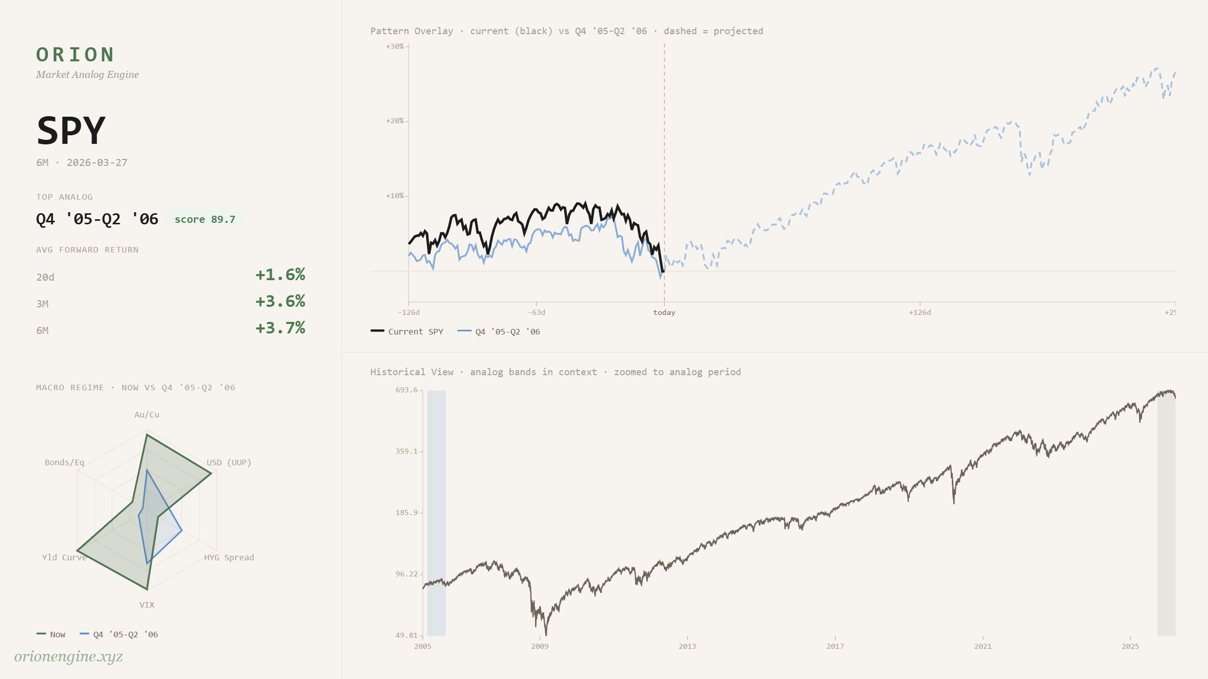
The top analog for SPY last 6 months is Q4 2005 to Q2 2006. Similarity score: 89.7%.
That period looks familiar in hindsight. The economy was quietly softening. Housing was cracking, the yield curve had inverted, credit spreads were starting to widen. Sentiment was cautious. And yet the index ground higher, putting in one final leg before the GFC unraveled everything.
The macro backdrop today is strikingly similar. Average forward return across analogs at 6M: +3.7%.
Zoom Out: The 5-Year Structure
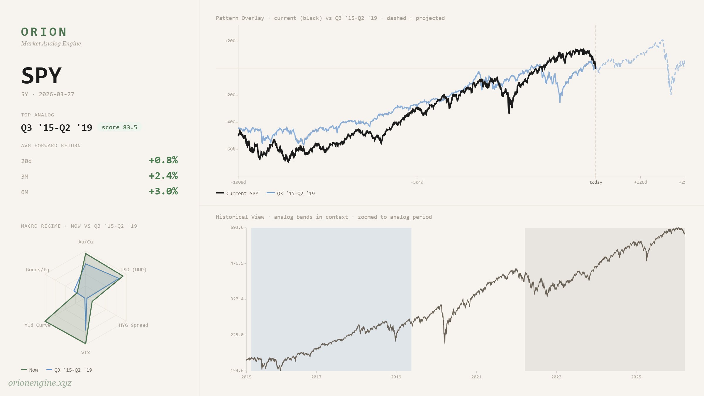
Pull back to the 5-year view and the picture sharpens. The top analog for SPY full 5Y range is Q3 2015 to Q2 2019. Score: 83.5%.
That stretch was defined by years of choppy consolidation and deleveraging. A market that felt like it was going nowhere, followed by one final blow-off leg into early 2020 before COVID ended the cycle.
The current 5-year structure traces almost the same path. Same base-building, same macro regime, same eventual resolution.
$IWM: Liquidity Squeeze Incoming
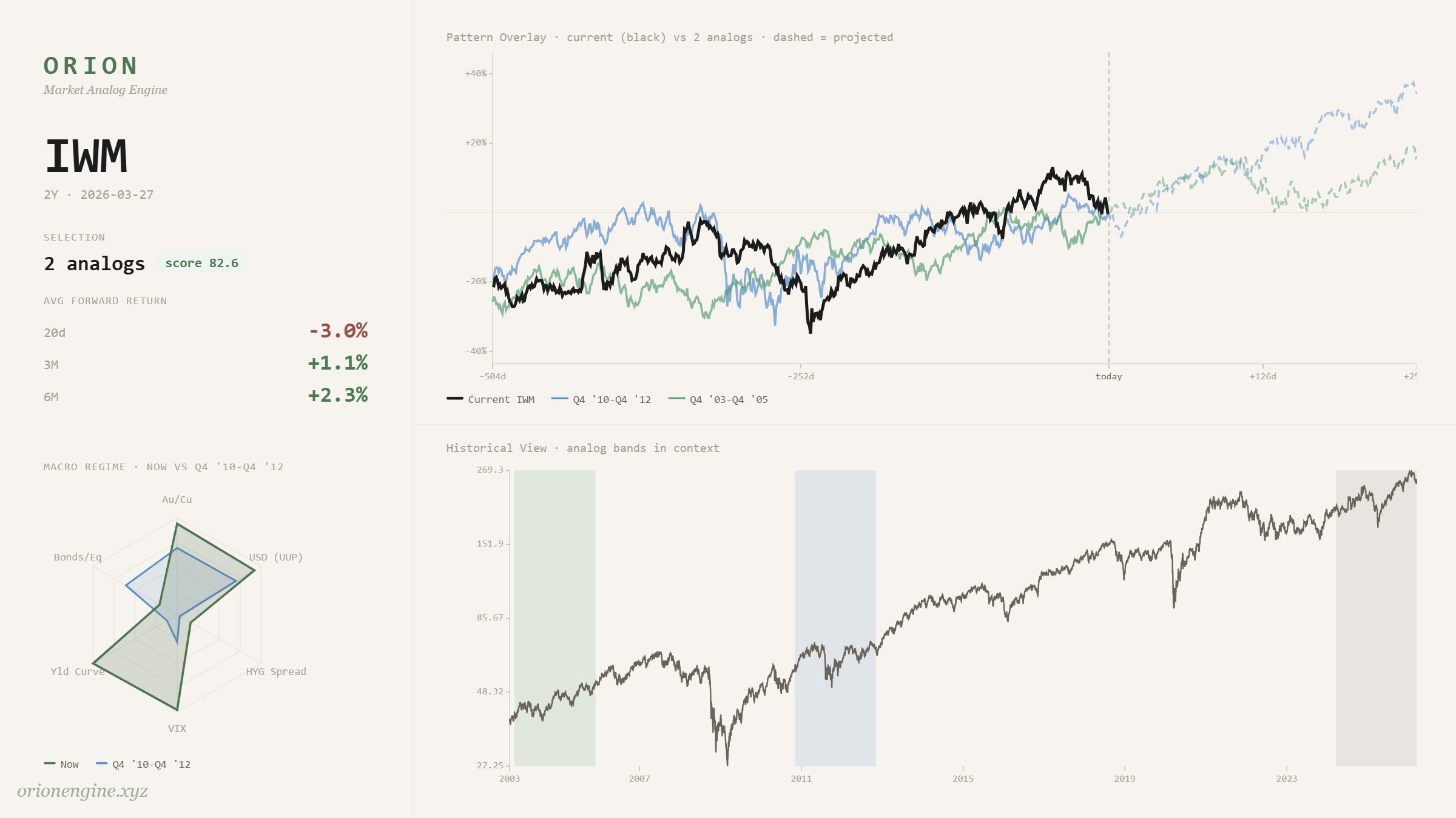
The Russell 2000 is the most liquidity-sensitive index. When risk-on flows return in earnest, small caps tend to move first and fastest.
IWM 2Y analog matches two distinct post-deleveraging periods, both of which resolved with significant upside squeezes. Average 6M forward return: +2.3%. If liquidity returns to the system as the analog suggests, IWM is the tell.
$DIA: The Crash Signal Hidden in Plain Sight
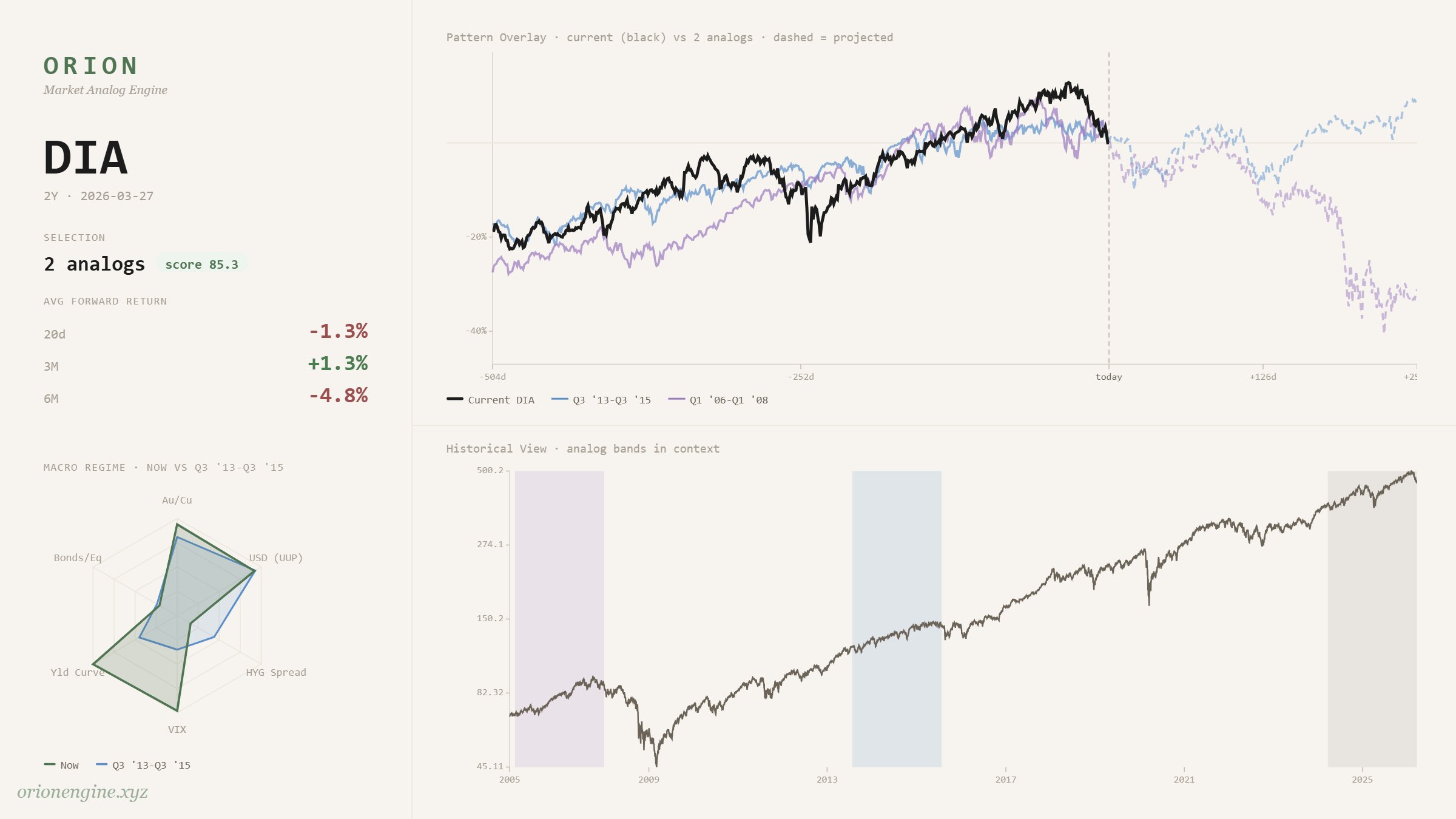
This is the most important chart of the four.
DIA historically leads the broader market at turning points. It tops before the others, it bottoms before the others. It is the tell.
Its top analog is Q1 2006 to Q1 2008, with a second analog pointing to the same era. Average 6M forward return: -4.8%.
That is not a bullish signal for DIA. But read it correctly and it is not a bearish signal for the broader market either. Not yet.
In 2006, the Dow started rolling over while the S&P and Russell kept grinding higher. Small caps in particular put in a final liquidity-driven squeeze before the cycle turned. DIA was simply first. The crash came later, and it came for everything.
If that analog holds, DIA topping now is not a reason to abandon the rally thesis. It is the confirmation that we are deep in the final act.
The Synthesis
Put it all together and a clear sequence emerges.
DIA is already showing the strain. It is the leader and it is telling you the cycle is late. SPY and IWM have one more move. A final risk-on squeeze, liquidity driven, likely measured in weeks to months. Then the whole structure rolls over together.
This is not "be bullish forever." It is "know where you are in the cycle." The analogs say we are in the window between DIA topping and the broader market catching up to it.
That window historically does not last long. But it has historically been violent to the upside before it ends.